


Photoshop’s great. You can edit lighting, correct poor colour and manipulate the image into a somewhat presentable form… It’s a photographer’s safety net. It’s also completely useless after you’ve pumped money into a nationwide rebrand only to realise the colour doesn’t translate well from screen to print. Your trusty hue/saturation tool can’t save you then. You’re stuck with what you’ve got.
Ultimately, this all comes down to colour management. Despite being responsible for the headaches of design and print specialists for years, colour management still doesn’t get the attention it deserves until much later in the process, when really, it should be top-of-mind as early as the design stage.
Let’s explore why:
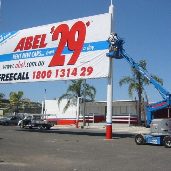
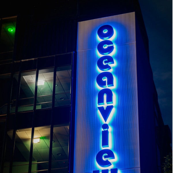
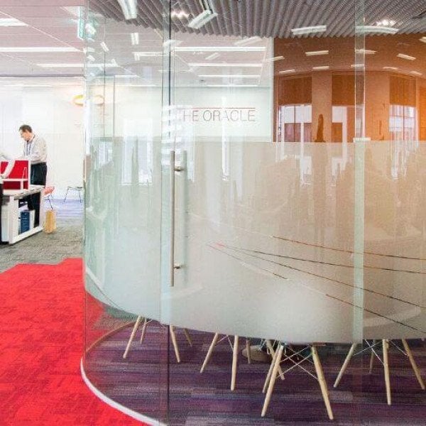
Impact
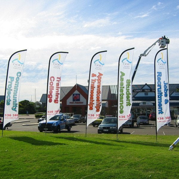
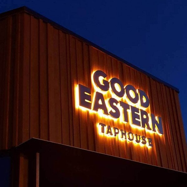
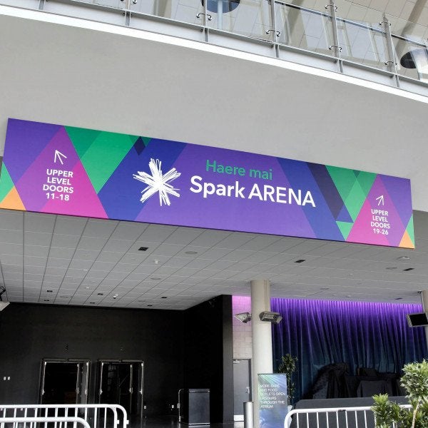
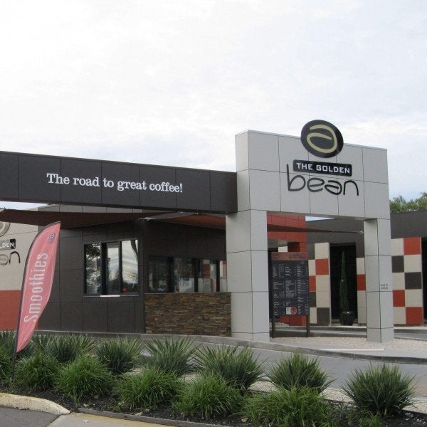
You wouldn’t be considering a signage strategy at all if you didn’t want to make some sort of impact. Whether it’s to shout out and be bold, guide people in the right direction or to evoke some form of emotion, chances are you’ve already decided on the type of impression you hope to convey. But whatever you’ve dreamed up, colour management can make or break it.
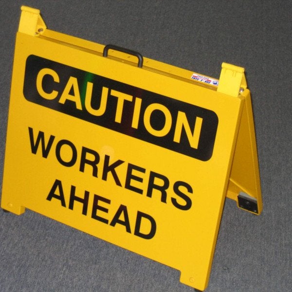
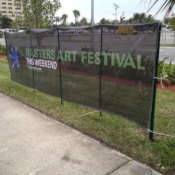
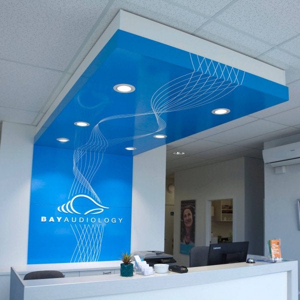
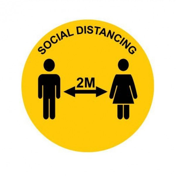
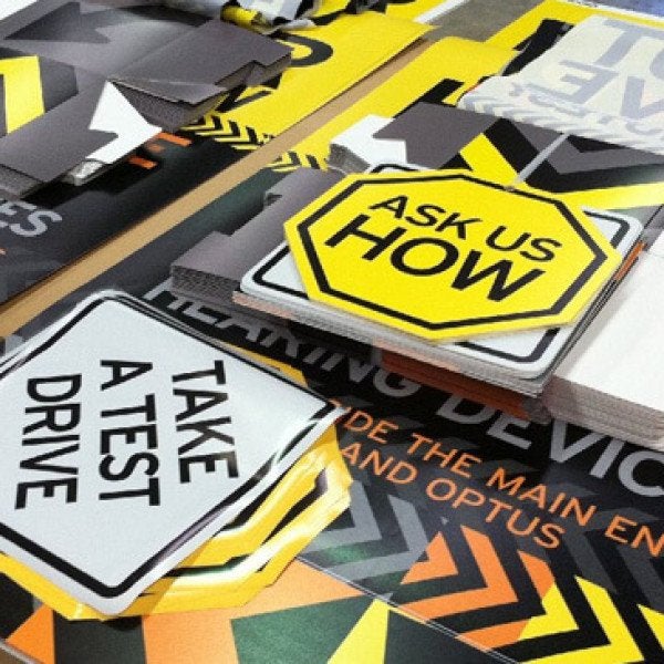
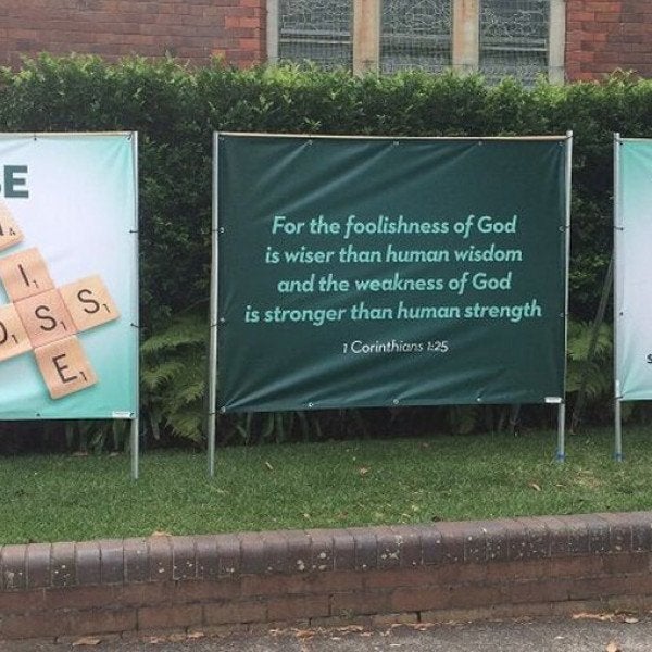
Remember that no two sets of eyes are the same. We all interpret and see colour differently – let’s use the colour yellow as an example. Yellow is the strongest colour psychologically as its wavelength is relatively long and stimulating. The ideal shade of yellow will evoke optimism, friendliness and confidence but the wrong tone or too much of it can actually instil feelings of anxiety and fear.
Let’s say you’ve picked the perfect shade of yellow. It says everything you want it to. Top psychologists even agree. What about when it prints? Is it happy enough? Does it look faded? Is it sickly? Even the slightest difference in colour could change the interpretation of your signage. It might make an impact – but is it the one you hoped for?
Consistency
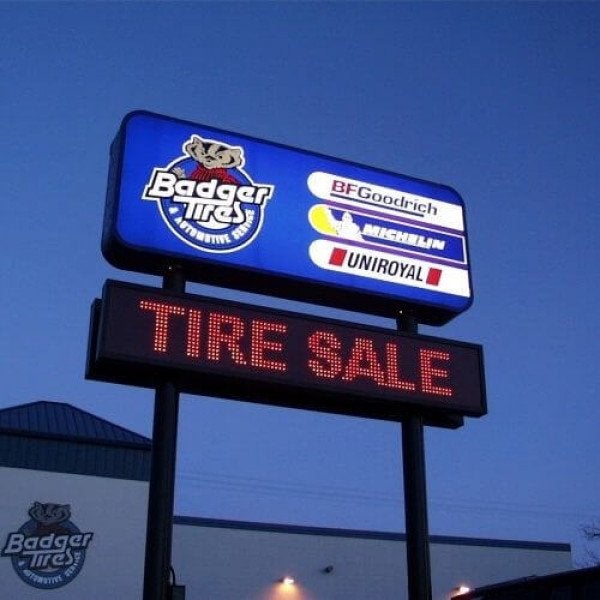
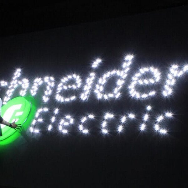
Now that you have the right shade of yellow that perfectly translates from screen to print, you would automatically assume that each subsequent printout would replicate that colour but that’s not always the case. Some colours are more challenging than others to reproduce consistently.
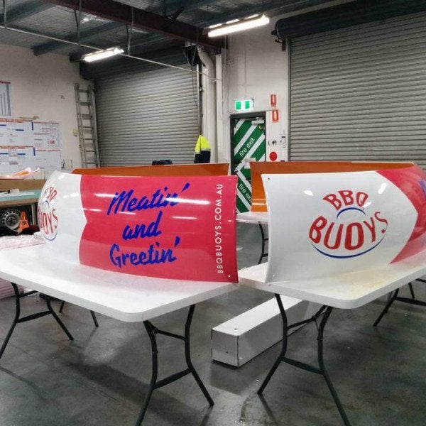
Let’s go back to the early 1960s. Stan Lee had just unleashed The Hulk. Originally he wanted the character to be grey so that it wasn’t suggestive of a particular ethnic group, but there was one problem. The grey wouldn’t stay consistent. In the very first issue, The Hulk can be seen sporting various shades of grey and even green – a different shade on each page. So if you’ve ever wondered how The Hulk became the iconic green it is today, now you know: it’s because it could be printed consistently from page to page, edition to edition.
Despite digital and technological advancements coming a long way since then, this issue does still arise – whether it’s because of mixing issues or surface texture, it still needs some thought, as without proper management the finished result could severely lower the quality of your project.
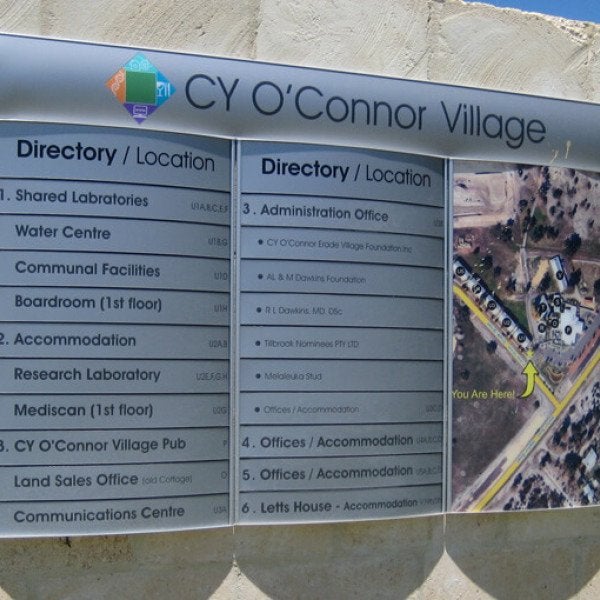
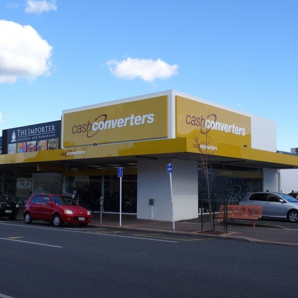
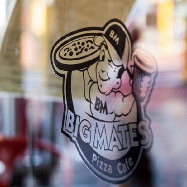
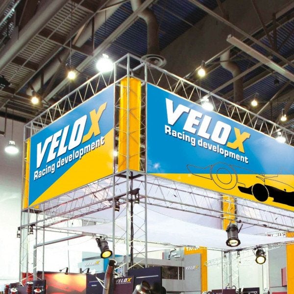
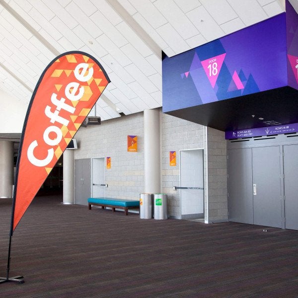
Brand Recognition
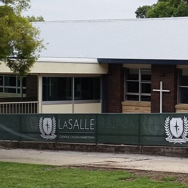
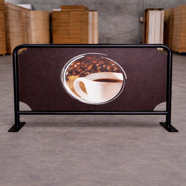
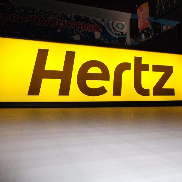
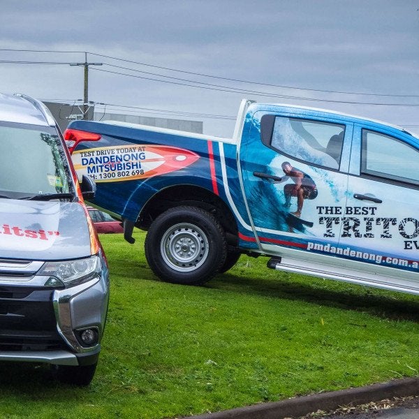
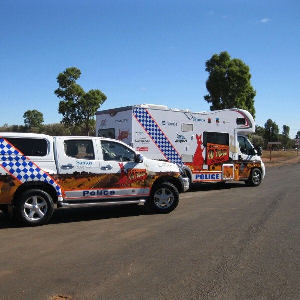
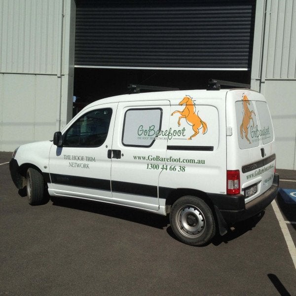
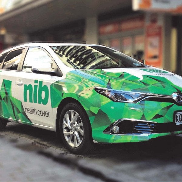
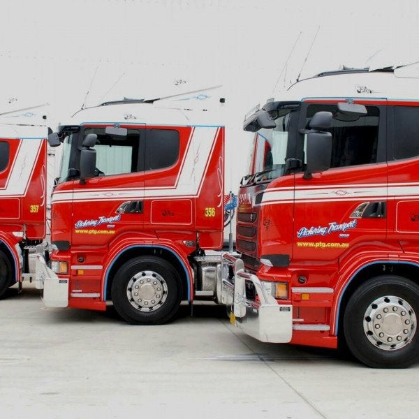
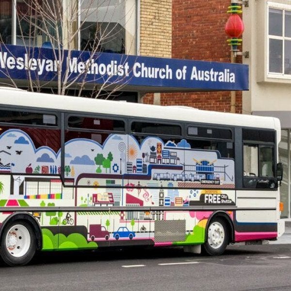
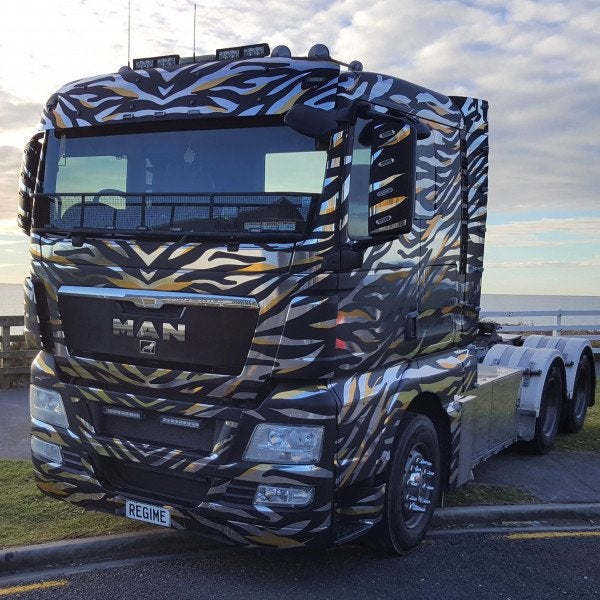
Brand recognition relies on the power of association. Let’s say you’re about to apply your branding to a large fleet of vehicles. No doubt you’ll want your customers to recognise you, but the level of exposure might be limited, especially when your teams are on the move. Enter subliminal message number one: colour. Think Cadbury. You see that purple and you just know. That’s because colour evokes recognition.
This is where exercising quality control and accuracy, through colour management, comes into play. More than just consistency, brand recognition can only be realised by following and meeting your brand’s guidelines. However, this is easier said than done once surface texture or quality finishes enter the picture.
Never thought about colour management before? Trust us, putting it off until later or overlooking it completely will not only cost, it will also damage your brand’s image. Instead, talk to us. At Speedy Signs we work with designersand are able to consult on colour at any stage of the process to deliver results that exceed expectations. It’s time to make colour management your biggest asset.
About Speedy Signs
Speedy Signs was founded in 1998 with a pilot store in Penrose, Auckland. Now approaching 20 years in New Zealand the group now operates in 25 locations from Whangarei to Invercargill, making it New Zealand’s largest sign network. Speedy Signs is affiliated with the international brand Signarama who have close to 1,000 locations operating in over 40 countries, making them the largest signage network in the world.
Speedy Signs design, manufacture, and install signs that will help businesses grow faster. Their installation service means they are a one-stop-shop signage provider. This service, partnered with the strength of the national network, means Speedy Signs’ clientele includes both large and small, national and regional businesses and organisations.
To find out more visit us online at www.speedysigns.co.nz or call 0800 SPEEDY (773 339)