So, we’ve decided to share our insight into iconography in branding by exploring what we can learn from international brands like McDonalds & Coca-Cola – you’ll never look at symbols the same way again!
A picture is worth a thousand words
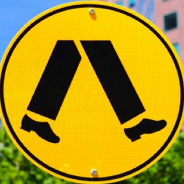
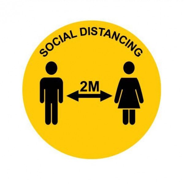
Symbols and icons were used as communication devices way before the written word. Why? Because they clearly and concisely convey meaning at a mere glance. No explanation required. How many times have you encountered a stop sign? And how many times in your life have you required an explanation for what that sign means?
Exactly.
Iconography is a universal language. If you’re standing in a supermarket in China and you’re fresh out of toothpaste, what do you do? Reach for a brand you recognise, or a brand you don’t? Again, this is the power of icons at work. One small flicker of familiarity can motivate a buying decision because it’s primitive, instinctive and easy. It provides people with a sense of unity and comfort.
The Golden Arches of McDonalds
Clever brands like McDonalds use the psychology of iconography to their advantage because they know people haven’t got the capacity to constantly question a brand’s intentions, purpose or value. They need to be presented with an easy decision. A clear winner.
McDonalds’ famous golden arches started off as a sign of promise to passing traffic across America. Think about it: You’re a hungry truck driver travelling through the night, and suddenly you see a lit-up yellow sign. It suggests warmth, a place to rest, and a source of food. The temptation to pull over becomes all too much and in you go. You’ll remember that feeling the next time you’re on the road.
The secret behind the golden arches wasn’t just clever placement. They simply decided that rather than wait for their audience to get to know their brand and draw their own conclusions, they’d take the lead by telling their audience what to think and feel instead.
Another reason McDonalds reached icon status was because they chose to be consistent. McDonalds is pretty much the same in every country, and the golden arches mean the same in every country. It conveys promise and value for money and it is due to this that the brand stays in the minds of millions of people every day.
The Coca-Cola Company
When you think of Coca-Cola you think of the colour red. But that’s not all the brand adopted in the name of iconography (although the colour was a clever choice). Did you know that Coca-Cola didn’t want to have ‘just a logo’? They wanted to be a brand that lasted forever. They wanted to be ‘feel-in-the-dark’ memorable.
They realised that to become truly iconic, they needed to communicate more than just their company name; they needed to communicate their entire value proposition - differentiation.
So, in 1914, they decided to turn their bottle into a symbol. Up until that point it had been just your average straight glass bottle – and then came the hourglass-style curves the brand still uses today. This was a powerful insight, way ahead of its time, because the makers realised that they needed a series of symbols that all worked together to build the overall brand story. Each element is like a new layer, giving the brand depth.
Coca-Cola understood that iconography takes many forms and can be the fundamental difference between a brand of today, and a brand of the future.
Turn your story into an icon, not your logo
To make your brand iconic, you must first understand that a logo is your company name. A practical and fundamental communication tool, yes. An icon in itself? No. An icon is a standalone visual that expresses your business idea, vision and story in a single image. It says it all without the need for a tagline or even a pause for thought.
How do you move beyond your logo?
Think about your brand as a story with many layers, then think about how that story would look if it was an image. This is where the heart of iconography lies. The biggest mistake a brand can make is to springboard off a logo, a name, because that’s not where the magic is. The magic is in the meaning. Find the meaning, create a symbol for that meaning, and you can’t lose.
Want to be iconic? Create an icon that acts as a visual handbook to your brand. Simple.
Remember, the goal is to build an unspoken connection with your audience, to help them make an easy buying decision – not to bombard them with a name that has no essence. Instead, bombard them with iconography that really means something!
Need some expert help?
Call 0800 SPEEDY today and we’ll help you harness the power of iconography!

